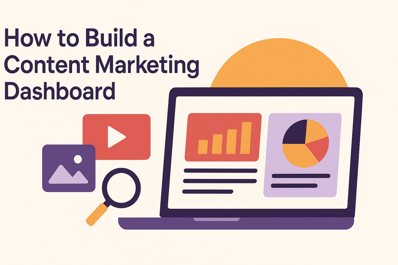
How to Build a Content Marketing Dashboard
Key Takeaways
-
With a content marketing dashboard, you give your team and stakeholders a centralized, unified view of your performance.
-
By aligning dashboard metrics with business goals, you make sure your content strategy supports your organization’s objectives.
-
Real-time insights from dashboards empower proactive decision making, helping teams shift tactics rapidly and anticipate trends.
-
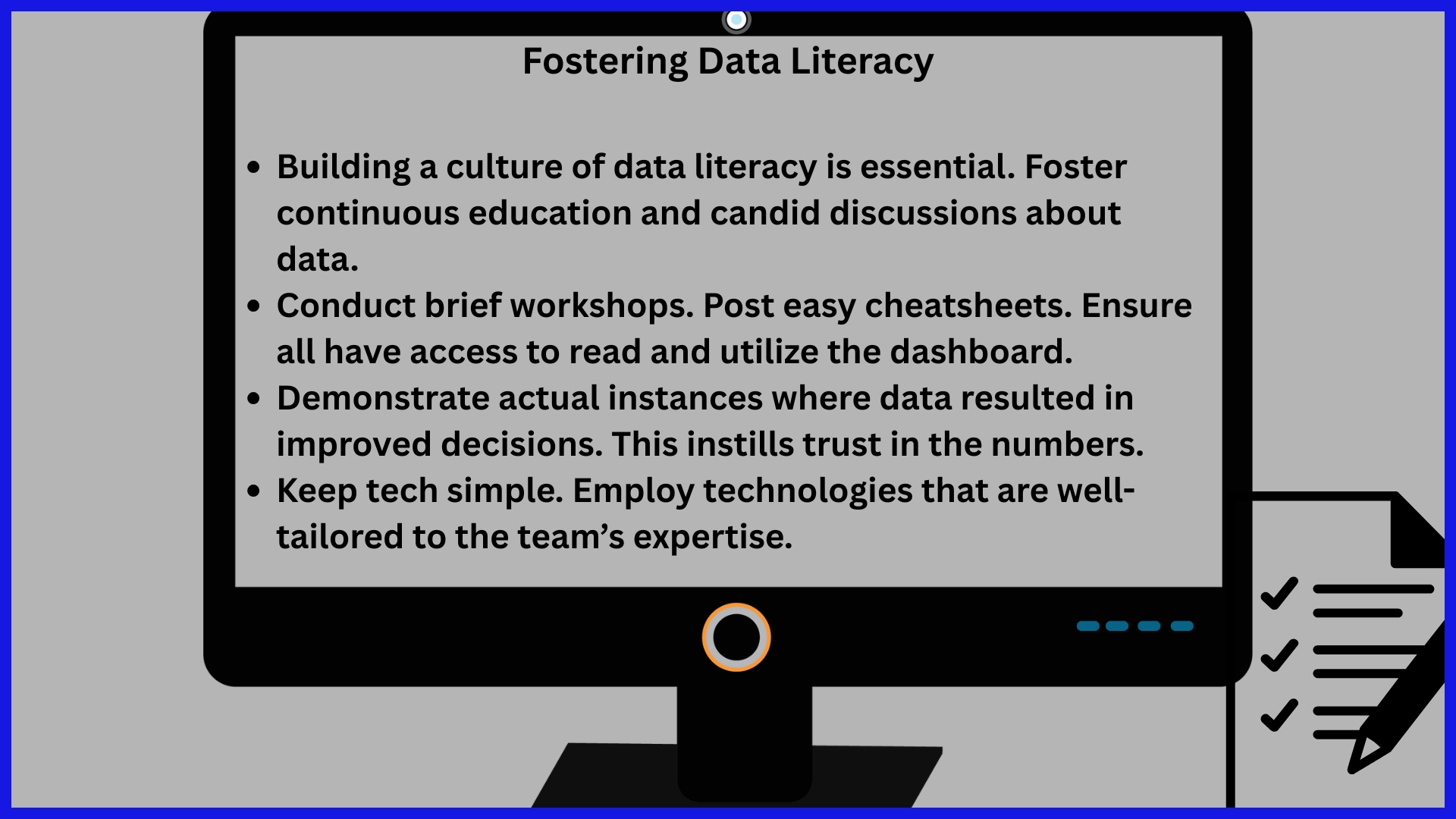
From my experience, building an effective dashboard requires defining clear objectives, choosing the right metrics, combining multiple sources of data, and making user experience a priority.
-
Periodic review and iteration of dashboards based on user feedback ensure accuracy, relevance, and usability.
-
Data silos and inaccuracies threaten trustworthy analysis and informed strategic planning.
What if you could see exactly what’s driving your content success, without digging through dozens of tabs or reports?
A content marketing dashboard consolidates all your essential data in one place, providing instant access to the key metrics that matter: clicks, shares, leads, and more. But it’s not just about visibility—it’s about making smarter moves, faster.
The best teams don’t guess what’s working—they know. And with tools like KPI.me, you can connect data from across channels, cut through the clutter, and finally see the full picture.
Here’s how the right dashboard can transform your marketing approach.
Why Dashboards Matter
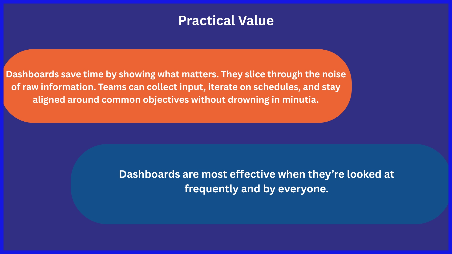
Dashboards centralize your content marketing data. They make it simple to view your content’s performance, monitor important metrics, and identify patterns without switching between platforms. For teams, dashboards provide a single, shared view that everyone can access, keeping stakeholders—from marketers to leadership—on the same page.
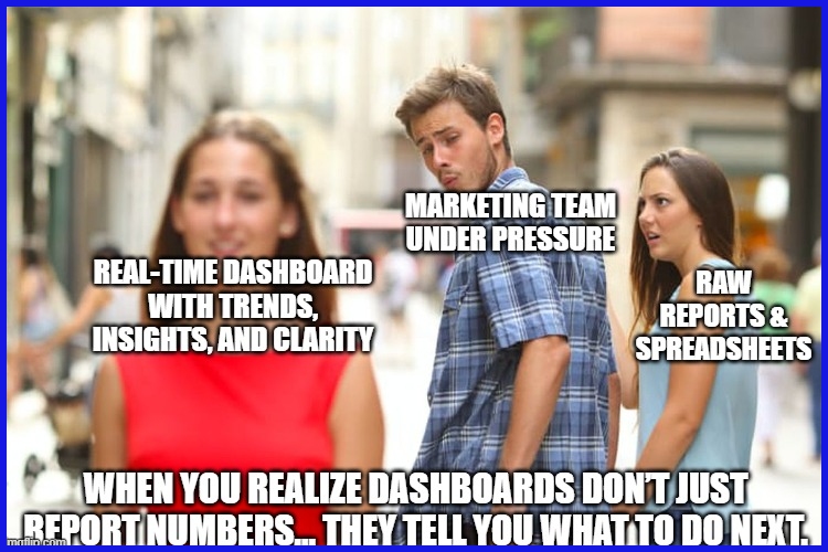
Beyond Reporting
Dashboards aren’t just about displaying numbers. They empower teams to transform data into action. If you notice a surge in social engagement or a decline in visits, you can drill down and discover what triggered it.
In this manner, dashboards emphasize trends that could slip through the cracks of spreadsheets or raw reports. As a bonus, teams can share insights with others via dashboards. For example, an SEO expert can identify which blog topics generate the most traffic, while a social media manager can demonstrate how posts increase conversions.
When we tell stories with data, everyone knows what’s working and what needs to change.
Strategic Alignment
Dashboards help teams connect daily work to larger objectives. You’re able to line up metrics, such as organic traffic or email signups, against your company’s goals. This clarifies how each campaign or content contributes to the big picture.
All can visualize the impact of their work. A content creator can see whether their articles are contributing to monthly traffic targets. An agency manager can monitor whether campaigns increase conversion rates, as intended.
Dashboard review tends to develop an ethos of accountability, since advances and deficiencies are continually apparent.
Proactive Decisions
As a matter of fact, a real-time dashboard allows teams to detect problems before they escalate. If a metric tanks, you can respond quickly. Perhaps a dip in engagement means something is going stale, so you mix it up.
Or, if a campaign is doing well, you can scale it while it’s hot. Dashboards facilitate experimentation. If you roll out a new video format and experience initial growth, you can fund it more.
Watching trends keeps your team ahead—you can make tweaks before your competitors do.
How to Build Your Dashboard
To build a content marketing dashboard is to shape a tool that exceeds a tally. It should help direct intelligent action and play nicely with your other tracking tools. Simplicity, accuracy, and usefulness are what count.
Here’s a step-by-step process to build such a dashboard:
1. Define Objectives
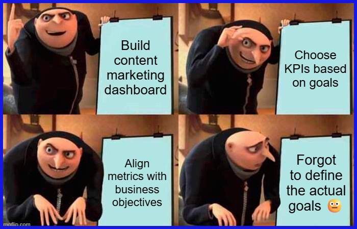
Begin with a mission in mind. Know what you want your content marketing dashboard to accomplish. Perhaps you want to measure your article readership, or you weigh blog-to-sale conversions more heavily.
Connect these objectives to your business objectives — are you attempting to expand brand visibility, increase engagement, or convert sales? That said, bring stakeholders into the process. This keeps everyone on the same page and prevents surprises down the line.
Capture your goals upfront, so you have a direction while building the dashboard. You write down these goals not as busywork, but as a guide to help you select the right KPIs and not get distracted.
2. Map Journeys
Imagine your customer’s journey. Map out each step, such as when someone encounters your content, subscribes to a newsletter, or buys. These are your contact points.
Feature those occasions where content influences decisions, like a how-to that assists someone in deciding on your product. Utilize this journey map to identify vulnerabilities. Are there pages where folks abandon too early?
Perhaps the call to action is difficult to locate. Mapping gets these rough patches to stop. That way, your dashboard isn’t merely following digits but assisting in making the whole experience more streamlined.
3. Select Metrics
Selecting appropriate metrics is crucial. Choose metrics that capture your objectives—page views, average read time, conversion rates, social shares, among others. Supplement the statistics (such as site traffic) with subjective data (such as user reviews) for a complete view.
Don’t overstuff your dashboard. Stick to actionable metrics. For instance, if you notice a decline in engagement, you realize it’s time to update your content. Return to your decisions frequently.
As your goals shift, so should your metrics.
4. Integrate Sources
You need a unified home for your data. Join sources such as Google Analytics, social media, and emails. Connect to APIs to pull in data and keep it fresh.
Don’t forget to clean your data! Verify against duplicates and missing values. With a dashboard built on clean data, you get an honest look at reality.
Monitor your integration frequently. Data tools and platforms change, so check back with connections to keep everything running smoothly. Real-time updates add tremendous utility to your dashboard.
5. Visualize Stories
Present your figures in plain language. Line graphs for trends, bar charts to compare, and scorecards for top KPIs. Keep your grids and backgrounds clear to let the numbers pop.
Experiment with various graphics and test which are most user-effective. Say no to clutter and bypass fancy graphs—pie charts that baffle rather than enlighten.
Let the images narrate. Highlight any trends, wins, or growth areas. Good visuals allow everyone to identify what’s important quickly.
6. Iterate Relentlessly
No dashboard is perfect at launch. Collect input on what’s effective and what’s not. Establish check-ins to see if the dashboard still works for you.
Little adjustments—such as shifting a widget or swapping out a color—can enhance clarity. Continue soliciting feedback and experimenting when necessary. This enables your dashboard to grow with your team.
Key Dashboard Types
Content marketing dashboards exist in many varieties, each constructed for a particular purpose or audience. A few dashboards fit content teams, others assist sales or leadership. Choosing the appropriate type means you deliver the right data to the right people at the right moment.
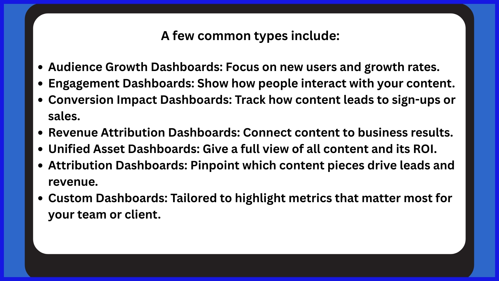
Audience Growth
See how new audience gains and trends are to check if your content is reaching more people. This type of dashboard tracks visitor sources, audience growth rate, and what channels drive them in.
Growth dashboards frequently display demographic changes, such as age or location, allowing you to determine if your message is engaging new audiences. By establishing standards and verifying them, you know whether your strategy is effective or requires modification.
Engagement Focus
Engagement dashboards highlight how users engage with content. Metrics such as time on page, scroll depth, bounce rate, and pages per session provide a granular insight into what captures attention and what doesn’t.
Understanding what pages get the most action allows teams to identify trends. If a blog post holds people reading, it becomes a template for future content.
These insights help to inform strategy adjustments, whether it’s headline copy or topic emphasis. Highlight what’s performing so teams can replicate it. Engagement by company or segment tracking helps tailor future campaigns.
Conversion Impact
Conversion dashboards track content’s ability to convert interest into action. We track sign-ups, downloads, and purchases to see what moves the needle.
Examining conversion rates for each content type allows teams to identify what performs best. This strategy simplifies goal-setting and call-to-action tweaking.
With real-time data, you can make changes fast and test quickly.
Revenue Attribution
Revenue dashboards tie content performance to sales. Attribution models illustrate what content assists most in the sales pipeline.
Following customer journeys from initial click to sale demonstrates which material packs the hardest punch. Displaying revenue and engagement together provides a complete view, allowing teams to understand where to invest time and money going forward.
Essential Performance Metrics
A content marketing dashboard aggregates essential insights for agencies and teams to visualize the real impact of their efforts. The right mix of performance metrics should be tied to business goals, evaluated frequently, and inform strategy going forward.
Below is a table listing essential metrics, their descriptions, and why they matter:
| Metric | Description | Relevance |
|---|---|---|
| Organic Traffic | Number of users from search engines | Measures reach and organic growth |
| Bounce Rate | Percentage of single-page sessions | Indicates content relevance and user interest |
| Conversion Rate | Ratio of goal completions to total visits | Shows content impact on business outcomes |
| Unique Visits | Count of distinct users visiting content | Tracks audience size and reach |
| Engagement (Shares, Likes, Comments) | User interactions with content | Gauge resonance and social proof |
| Repeat Visits | Frequency of users returning to the content | Assesses loyalty and retention |
| Inbound Demo Requests | Number of demo requests via content | Tie content to lead generation |
| Pipeline Sourced | Revenue pipeline is directly influenced by content | Aligns with sales goals |
| UTM-Tagged Traffic | Tracked sources using UTM codes | Pinpoints effective channels and partnerships |
Effective dashboards harness these nine KPIs to ensure activities connect to specific outcomes, validate investment, and determine where to concentrate next. This weekly review of these essential performance metrics can identify trends, illuminate common threads among popular content, and identify problems before they become larger.
Consumption
Monitoring content consumption frequency enables teams to understand effectiveness. Unique visits indicate how many people the content reaches, making popularity transparent.
For instance, a surge in unique visits following a new blog post may indicate successful marketing or subject matter. Knowing when your users read your content can help identify these high-engagement times.
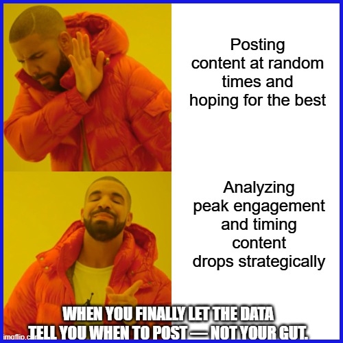
If analytics indicate that the majority of visits occur on weekday mornings, teams can strategically time distribution for greater impact. This goes a long way toward fine-tuning publishing schedules and campaign timing.
Being able to see traffic sources over time is key. With a UTM tagging strategy, you can track which third-party sites, search engines, or campaigns are driving the most visitors.
Agencies can then concentrate resources on relationships or channels that deliver actual performance.
Engagement
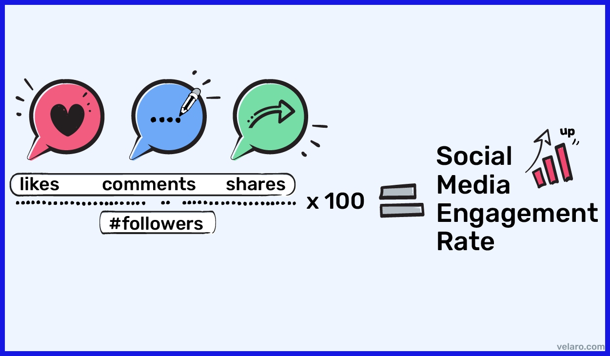
Tracking engagement—such as shares, comments, and likes—illustrates how the content resonates with readers. A big share count indicates that readers see something valuable enough to share, and comments signal a lively conversation and deeper level of interest.
Examining engagement trends can assist teams in identifying the content that ignites the most activity. For example, video explainers could receive more shares, while long-form guides attract insightful comments.
This feedback guides future content to formats that work best. Tracking these signals over time illuminates trends. If engagement drops, it could be an indicator to freshen up subjects or styles.
If it goes up, teams know they’re doing something right.
Conversion
Conversion metrics are key for demonstrating content ROI. Following conversion rates, per campaign or page, reveals what motivates users to act.
For SaaS brands, this might be sign-ups or demo requests attributed directly to blog content. A/B tests might pit headlines or call to action, or layouts.
Teams utilize this information to optimize content. Delayed conversions matter as well—lots of users find a brand by content and don’t convert until months later. Monitoring these long-term consequences helps capture the complete effect.
Retention
Repeat visits measure whether your content keeps users returning. Returning readers in a steady stream typically indicate very high loyalty.
Retention metrics catch churn. If fewer users return over time, you might have a hole in content or a requirement for new topics. This insight directs updates to maintain audience interest.
High retention propels other metrics, such as pipeline sourced and quarterly revenue tracking. Loyal users are more apt to convert and increase long-term outcomes.
Overcoming Data Challenges
Constructing a content marketing dashboard frequently hits data snags. Between disorganized data, incorrect inputs, and overwhelming noise that makes taking action difficult, teams encounter challenges. These hurdles interfere with the transparent, real-time understanding required for clever decisions. Useful dashboards are based on solving these issues, leveraging the appropriate tooling, and ensuring that the rest of the team can interpret and apply the data.
Data Silos
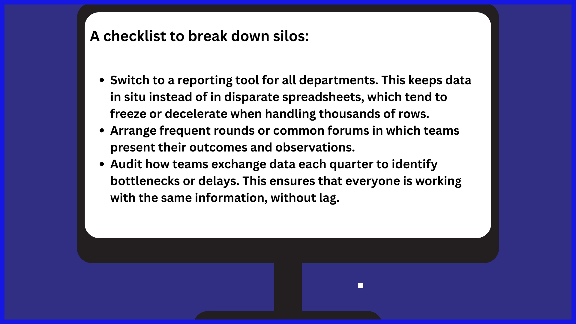
Data silos divide information across groups, hindering your ability to get a unified picture of how campaigns perform. When your marketing, sales, and product teams all maintain separate records, it’s simple to lose sight of the overall landscape.
Inaccurate Data
Incorrect data equals awful decisions. If campaign data is skewed by an ad network, it’s impossible to evaluate the effectiveness. Periodic auditing & training catch dirty data before it kills.
First, map out where errors occur. This may be manual data entry or syncing errors across platforms. Audit data capture per month. Use checklists to verify that data aligns across channels. Educate team members on data entry best practices.
There, automated tools can come to the rescue, reducing mistakes and providing accurate scaling figures quickly. When dashboards operate on real-time, accurate numbers, teams use less time correcting errors and more time implementing insights.
Analysis Paralysis
Excess data bogs down clever decisions. Dashboards that display all conceivable numbers tend to leave teams stalled in the dark about what to do next. To fix this, focus on what matters most: metrics tied to growth and revenue, not just likes or page views.
Define a concise list of key KPIs. Ensure the dashboard places these front and center. Describe why each metric is important, so the team knows what to look for. If you use charts and tables, make sure they are easy to read.
Provide explicit analysis objectives so time is focused on insights, not aimless investigating. Customize dashboards to suit the team’s requirements—one size never fits all.
Advanced Dashboard Strategies
Content marketing dashboards are so much more than simple reports. They unite data, team workflow, and objectives, providing visibility around what’s most important. Advanced dashboards rescue teams 5–10 hours a week by automating data pulls and reports—no more spreadsheet wrangling or clashing figures.
When done right, a dashboard provides real-time visibility into metrics such as engagement, conversion paths, and revenue contribution. Customization lets teams track what’s relevant, from drag-and-drop report building to deep dives on website trends such as session length, bounce rates, and visitors. This single source of truth makes all your teams move fast and focus on strategy, not grunt work.
Predictive Analytics
Predictive analytics elevates dashboards a step further, leveraging historical data to estimate the potential success of future campaigns. Teams can identify trends ahead of the curve, such as what content formats tend to generate greater engagement or conversions.
With machine learning, dashboards get smarter over time — they begin to surface rhythms that could be overlooked by the human eye. Less speculation, more factual planning. When these insights are shared with stakeholders, everyone can make more informed decisions about what content to boost or alter next.
Custom Segmentation
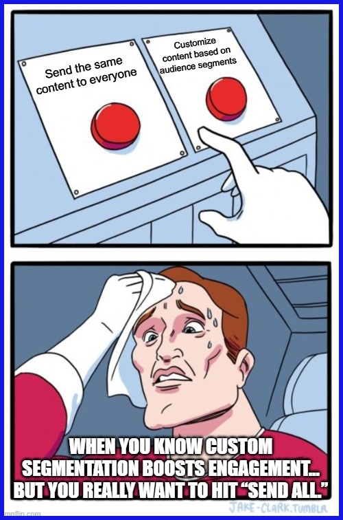
Custom segmentation allows teams to segment their audience into smaller cohorts, viewing which content resonates with different user segments. For instance, a B2B agency may configure segments for small businesses and enterprise clients, monitoring each group’s distinct engagement and conversion figures.
Teams can then tailor tactics to align with the objectives or pain points of each cohort, be that deep-dive technical guides for one or quick tips for another. With key metrics monitored by the group, it becomes easier to identify new opportunities or missing coverage.
Segments require frequent review, as audience behavior can change rapidly — what works this month may not work in the next.
Comparative Analysis
Putting your content’s results in context by comparing them with previous periods or other brands identifies what’s working and what’s not. Trends such as a climbing bounce rate or flat conversions can indicate when to experiment with new tactics.
When you share these insights with your team, you build a culture of learning and keep everyone focused on winning the next round.
Conclusion
A smart content marketing dashboard pulls your data into one place and keeps your team aligned. Presented with clear numbers, easy charts, and live updates showing what works—fast—you can tweak your plan or experiment with new ideas. Top dashboards filter through the clutter and display only what’s important to you, such as traffic, leads, or sales! Even little teams can play smarter with the right tools. Build a dashboard that matches your workflow. Start with easy charts, expand from there, and continue to experiment with what you measure. Give KPI.me a spin and experience how effortless it becomes to wrangle your reports and spread wins with your gang.
Frequently Asked Questions
What is a content marketing dashboard?
What is a content marketing dashboard? It allows you to monitor, quantify, and evaluate your content marketing activities.
Why are dashboards important for content marketing?
Dashboards provide clear, real-time insights into your marketing activities. They help you quickly spot trends, evaluate campaign success, and make informed adjustments to improve results.
What are the key metrics to include in a content marketing dashboard?
Add things like website traffic, engagement, conversion, lead generation, and ROI. These metrics help you quantify how effective your content is.
How do you build a content marketing dashboard?
Begin with your goals and key metrics. Select a dashboard tool, link your data sources, and adapt the layout to display key information.
What are the common types of content marketing dashboards?
Typical examples are executive dashboards, campaign dashboards, and channel-specific dashboards. Each type emphasizes different data for different business needs.
How can I overcome data challenges in dashboard creation?
Use solid sources of data and normalize them, and audit your metrics. This keeps your dashboard accurate, relevant, and actionable.
What are advanced strategies for dashboard optimization?
Combine automation, predictive analytics, and data visualization tools. These tactics help you get to know and move more quickly with your content marketing data.