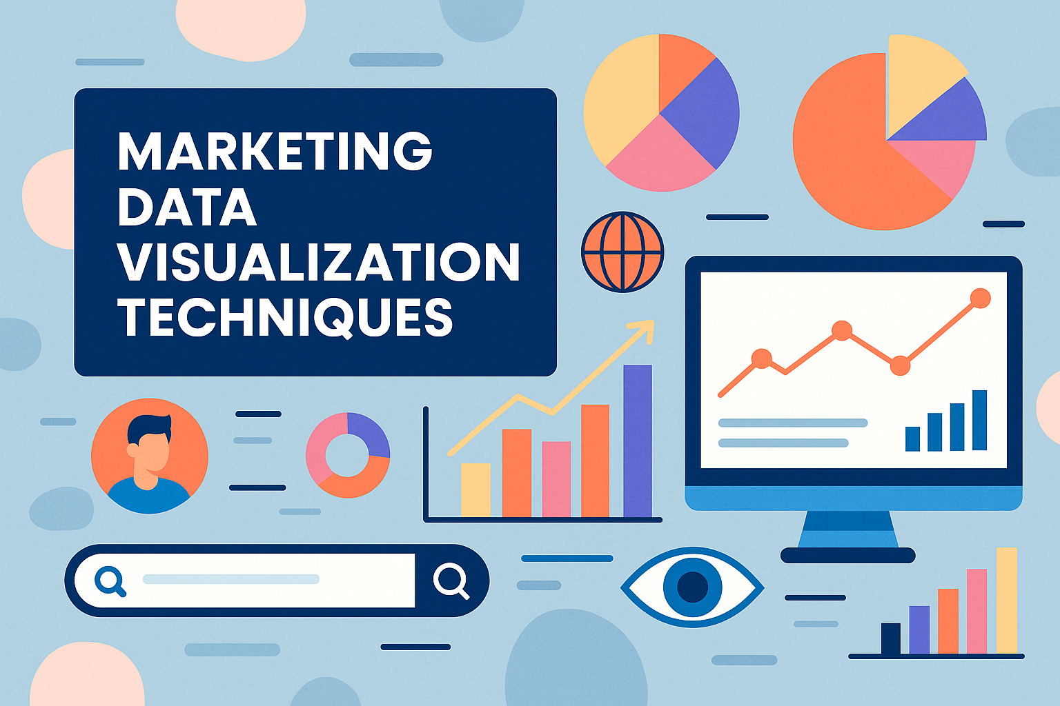
Marketing Data Visualization Techniques
Key Takeaways
- Marketing data visualization condenses complicated data into easy-to-read charts and graphs, allowing you to identify trends quickly and report on performance. When done right, these visualizations empower more informed decisions that enhance marketing initiatives.
- It’s much more compelling to tell a story with your marketing data than to present the numbers. Providing context and enhancing with visuals helps bring your message to life so your audience understands the most important insights.
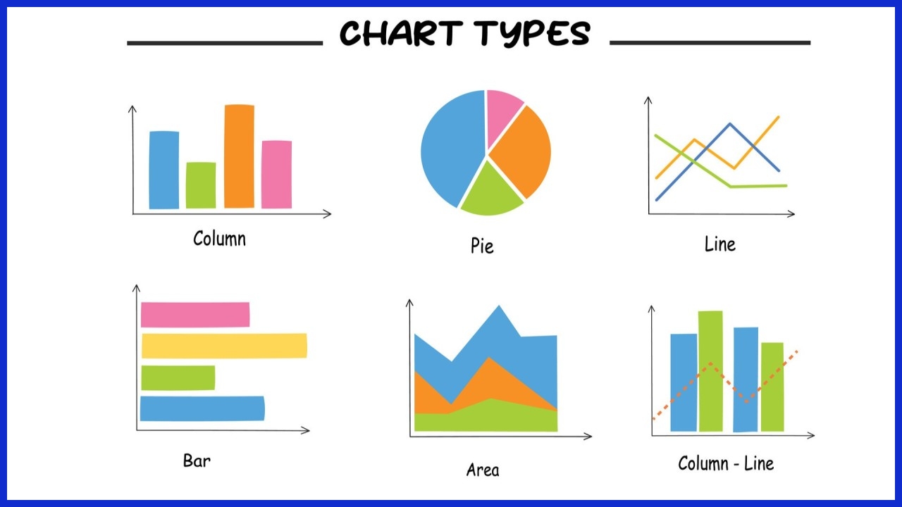
- Each chart type is useful for different marketing objectives. Use line graphs to show changes over time. Bar charts are the best choice for category comparisons, pie charts to compare parts to a whole, or gauge charts for tracking key performance indicators and sales funnels.
- Simplicity and clarity are key components of marketing data visualization techniques. Minimize distractions and maintain a clear brand aesthetic. Choose colors that maintain readability and guide viewers through your content, allowing them to instantly understand your message.
- User-friendly tools, such as business intelligence platforms and advanced spreadsheets, make it easier for marketers to create, customize, and automate data visualizations without technical expertise.
- Keeping up to date with new technologies, like AI and predictive analytics, can help marketers stay ahead of the competition. It reveals new insights and allows for more informed, data-led choices to be made.
Marketing data visualization helps teams turn complex numbers and trends into simple, easy-to-understand visuals. Tools like bar charts, heat maps, and pie graphs make even the most complicated data clear and accessible.
With the right visuals, teams can absorb information much faster, speeding up how they spot wins, catch problems, and make smarter decisions.
These visualization techniques are widely used by marketing teams across the U.S. Whether it’s in client reports, campaign tracking, or public updates, these tools help agencies communicate insights more effectively.
In the next section, we’ll explore some of the most common and effective options.
What is Marketing Data Visualization?
Marketing data visualization is the practice of presenting complex data in clear, visual formats, such as graphs, dashboards, or a geographic map. This enables marketers to identify trends, patterns, and insights that numbers alone may obscure. The unmanageable amount of marketing data increases daily.
Spreadsheets just aren’t going to cut it. Spreadsheets aren’t enough for marketers to interpret all this! Effective visualizations pierce through the noise. They help teams identify what’s successful and what requires further optimization.
Once marketers understand how to leverage visuals, they have the power to translate complicated analytics into simple, digestible insights that lead to more effective strategies and decisions. Additionally, visual tools make it easier for teams to communicate results throughout their company.
The right dashboard can convey the effectiveness of a campaign, the behavior of customers, or the trends of sales in one quick overview. That in turn enables quicker, more confident decision-making. Whether you’re deciding where to allocate ad dollars or revising a campaign’s message, you’ll be empowered to make the right decisions.
Traditional examples would be bar graphs to compare test results, pie charts to display market share, and heat maps to illustrate location-based trends. All these combined to make it easier to illuminate what’s most important.
Marketing data visualization uniquely combines the technical side — the analysis — with the creative side — the storytelling. Marketers will have to exercise more quality control, choose the appropriate data visuals, and always maintain a concise and engaging narrative.
This method not only reveals unexpected connections within the data but enables teams to share their findings in a more impactful way.
Beyond Numbers: Telling Data Stories
Data storytelling is the bridge between those raw numbers and the business impact they could have. Providing context when marketers use visuals with context, they build a fuller story that’s easier for any audience to follow.
For example, showing how seasonal trends affect sales with a line graph, paired with short notes, makes the data more relatable. This type of narrative is compelling to teams, motivates them to understand the importance of outcomes, and focuses all stakeholders around common objectives.
Why Your Campaigns Need Visuals

Visuals allow your audience to quickly process complex ideas and recall messages that resonate. In a marketing report, a simple chart illustrates a main point more effectively than words alone. Effective visuals create an emotional connection, which is crucial to brand recognition and increasing brand engagement.
With these powerful visual tools, marketers are able to effectively communicate the impact of their campaigns and better inform future decisions.
Core Marketing Visualization Techniques
Marketing data can be complex and high in volume. Understanding it requires simple, actionable visualization tools that make it easier for teams to identify critical trends and respond rapidly. The proper visualization technique can help you breathe life into those raw numbers and help them cut through the noise.
Perhaps most importantly, it uncovers the true narrative behind campaigns and metrics. In the US, marketing agencies and in-house teams lean on a range of charts and dashboards to turn their data into insights that drive business forward. Choosing the appropriate visual means winning successes can be celebrated, problems can be identified, and teams can avoid wasting time on complex descriptions.
This section explains these core techniques, how they function, and contrasts their optimal applications in marketing.
|
Technique |
Best for |
Strengths |
Weaknesses |
|---|---|---|---|
|
Line Graphs |
Tracking trends over time |
Clear, shows patterns |
Not ideal for many categories |
|
Bar Charts |
Comparing categories |
Easy side-by-side comparison |
Can get crowded |
|
Pie Charts |
Showing parts of a whole |
Simple proportions |
Hard to read with many slices |
|
Gauge Charts |
Monitoring KPIs |
Quick performance check |
Limited data per gauge |
|
Funnel Charts |
Visualizing conversion stages |
Maps user flow, drop-offs |
Only fits step-based data |
|
Geo Maps |
Regional data and opportunities |
Shows location differences |
Needs accurate geo data |
|
Interactive Dashboards |
Real-time, multi-metric reporting |
Customizable, dynamic views |
May need training or setup |
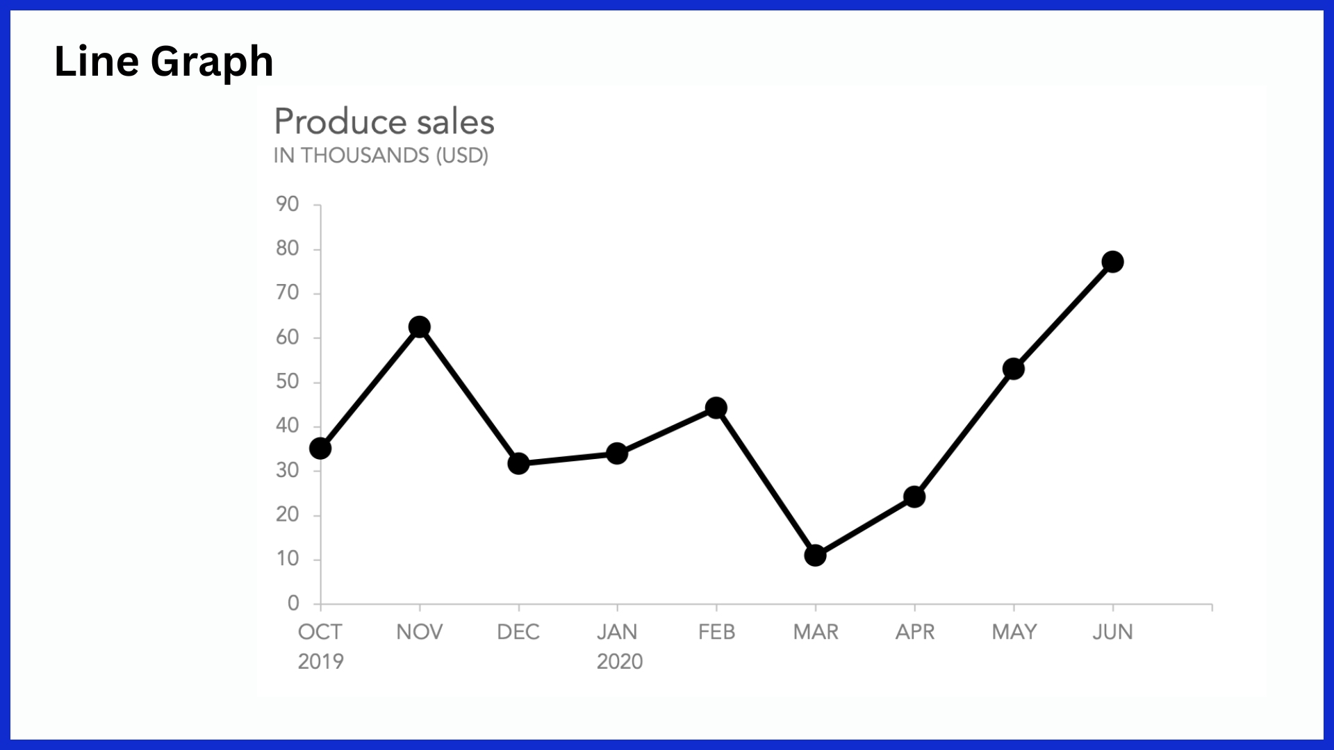
1. Track Trends with Line Graphs
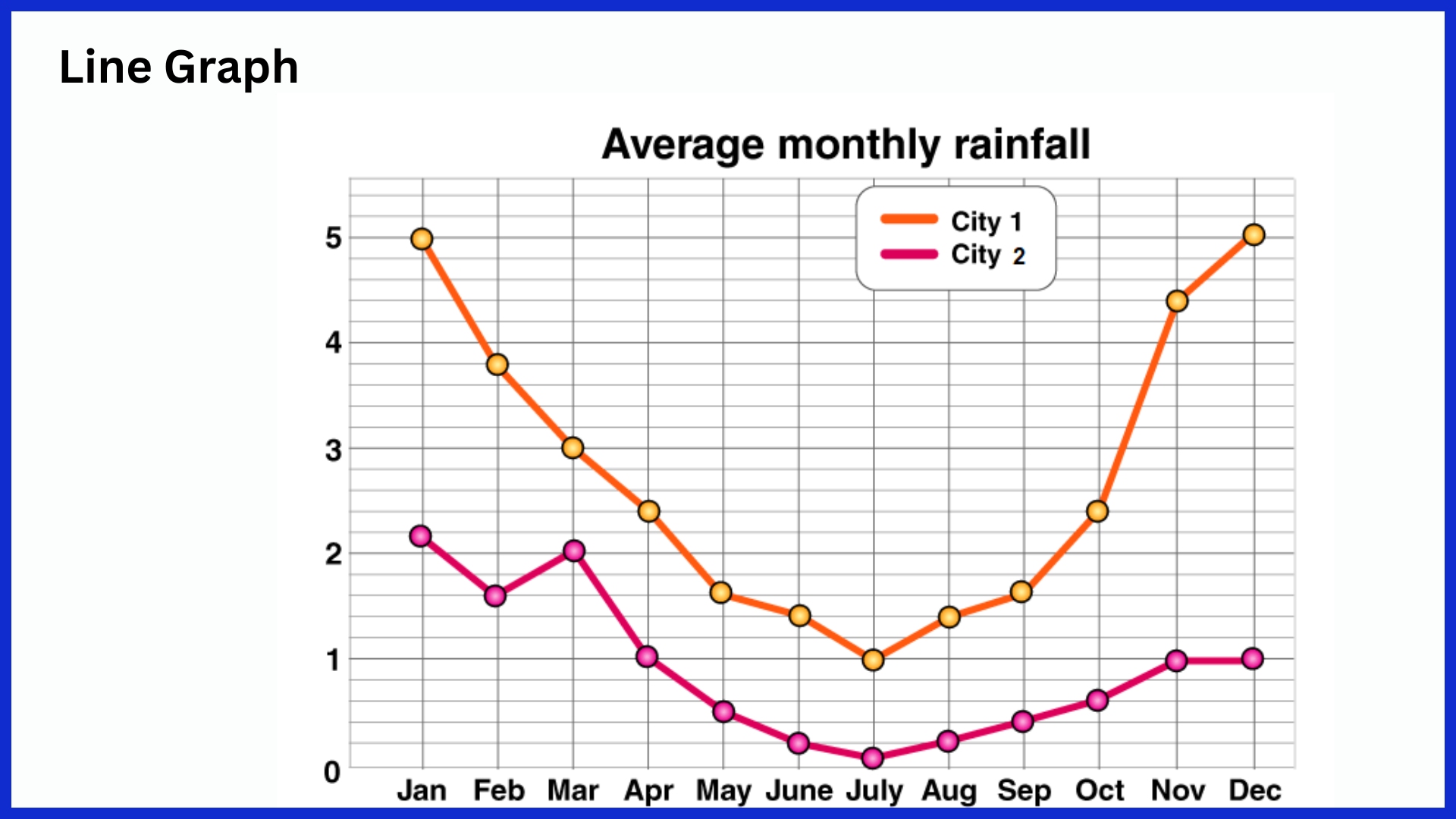
Line graphs are the rock stars of marketing analytics. Their sole purpose is to connect data points across time, which makes them ideal for displaying trends. A line graph is the best way to visualize a website’s daily traffic over time.
It’s great for understanding how engagement trends on an owned social media channel over a quarter. Having multiple lines on the same graph enables you to see the difference right away. You can compare multiple campaigns, traffic sources, or customer segments in the same view!
This allows easy identification of spikes, dips, or long-term changes in outcomes by the teams. Since line graphs are clean and continuous, patterns pop out without distraction. Any time-based data, such as sales by week, ad clicks by day, or newsletter sign-ups by month, comes alive with new, vibrant detail. Showing it in a line graph highlights those trends!
2. Compare Metrics with Bar Charts
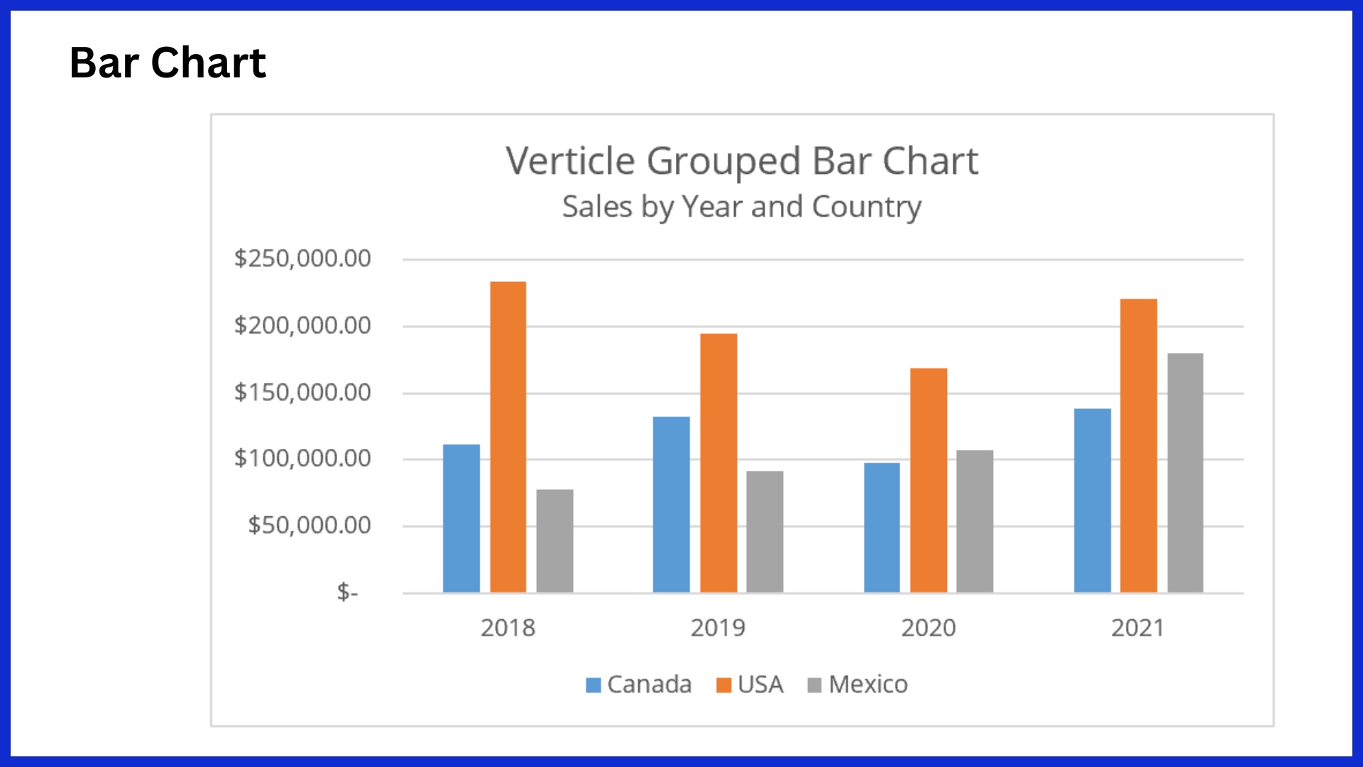
Bar charts are most effective when comparing values across different groups or categories. In marketing, these could be product sales per quarter, ad spend by channel, or leads per campaign. Vertical bars are typical for categories that have names, but horizontal bars work better for longer labels or a larger number of objects.
Stacked bar charts break each bar into colored segments, so teams can see not just the total, but how each part contributes to it. Including color coding makes it easier for readers to distinguish between different data sets at a glance. Bar charts are straightforward and commonly understood and read.
3. Show Parts of Whole: Pie Charts
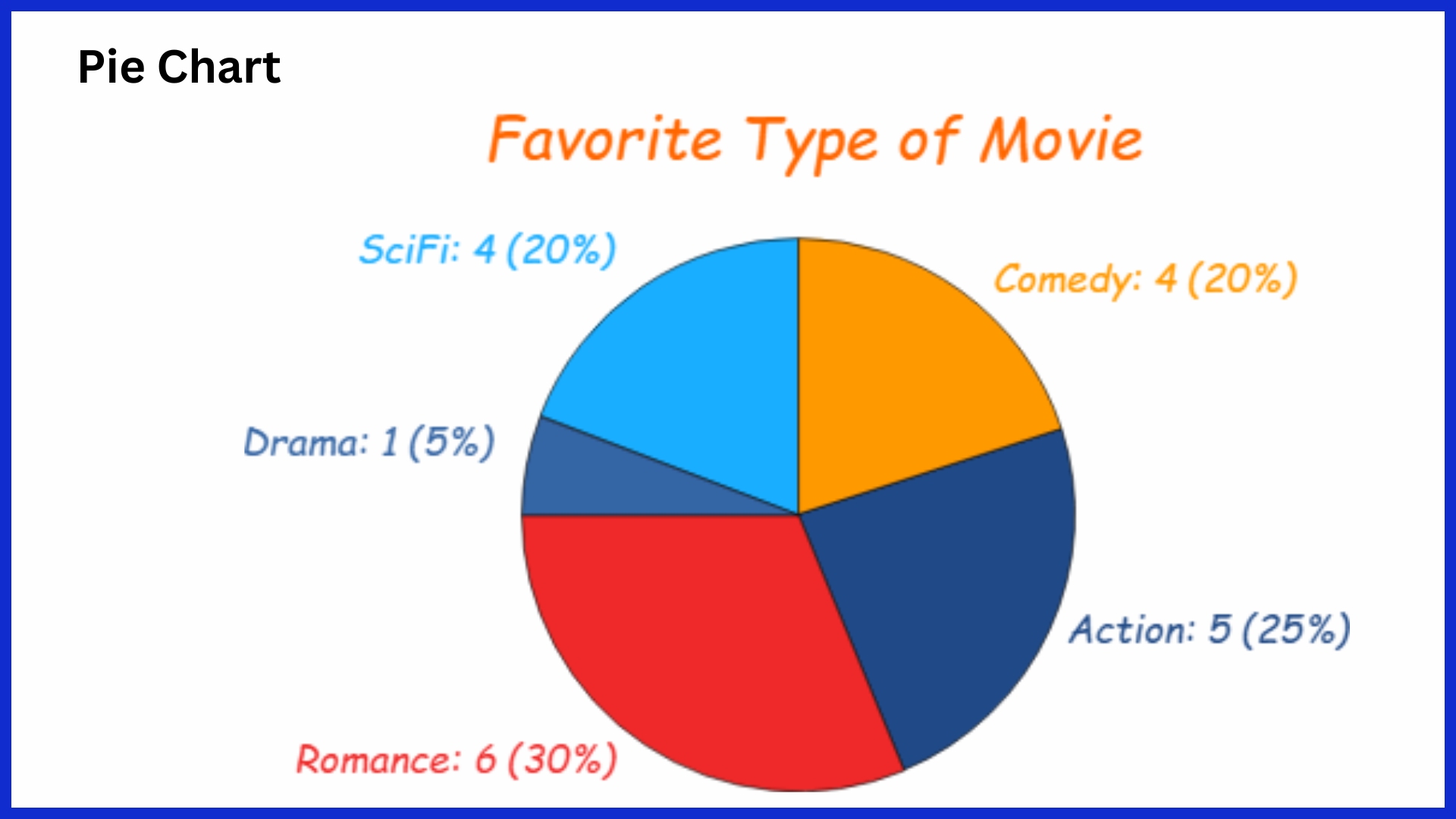
Pie charts only work to show how each piece adds up to a total. As a result, marketers love to create these to show where traffic is coming from. They further break it out by device type or budget by channel share.
Each “slice” represents a category’s contribution to the overall total. So paid search takes up half the pie, organic and direct fill in the rest. However, pie charts do have some drawbacks. Once you go beyond 5–7 slices, or when the categories are relatively equal in size, it becomes difficult to distinguish between the differences.
To prevent overcrowding, limit it to a few slices and include percentage labels. Pie charts should be used for quick, visual splits, not side-by-side close-up comparisons.
4. Monitor KPIs with Gauge Charts
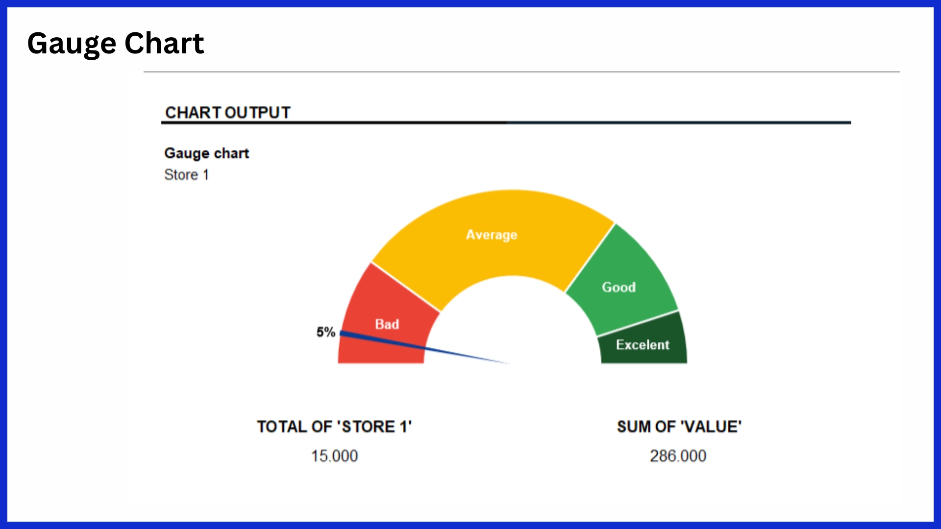
Gauge charts (like a speedometer) provide a fast, at-a-glance indication of how a key metric is performing. They are often found in marketing dashboards to track KPIs such as campaign ROI, lead conversion rates, or budget utilization. Each gauge displays one value compared to a target, using colored sections (red, yellow, green, etc.) to indicate ranges.
This configuration allows teams to quickly determine if they are on schedule, late, or far ahead of schedule. Gauge charts work well for monitoring a limited number of key metrics that require frequent monitoring. Setting specific goals beforehand is essential to ensuring these charts are anything more than glorified speedometers.
5. Visualize Funnels for Conversions
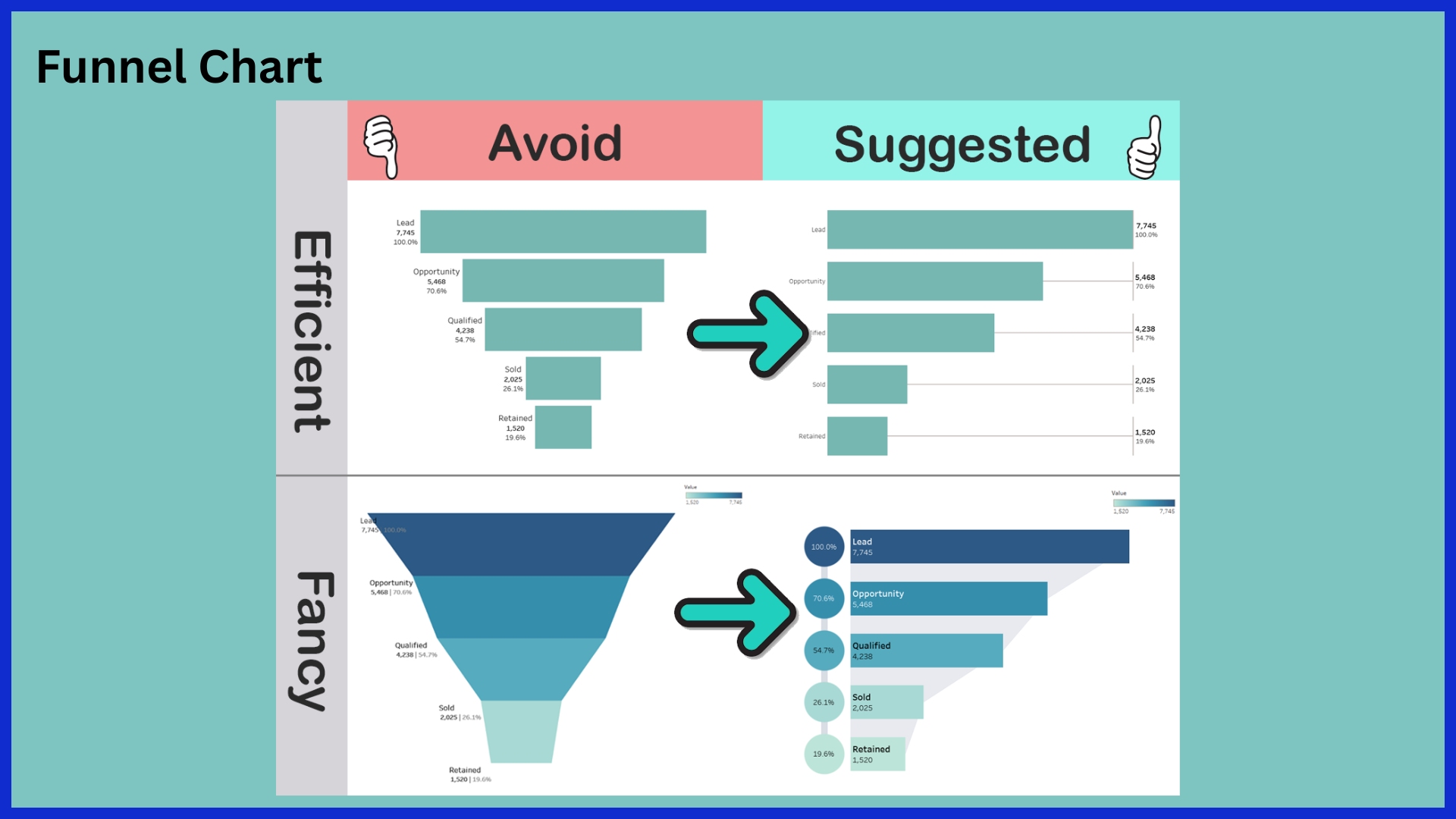
Funnel charts visualize the progression through a series of stages, such as going from impressions to clicks, to registrations, to purchases. In marketing, they visually represent where prospects fall off and what stages need the most improvement. By sizing every stage, funnel charts quickly help identify losses and wins along the conversion path.
Marketers leverage them to better test new concepts and ideas and patch leaks in campaigns. By including funnel charts in dashboards, teams can monitor shifts through the funnel over time and stay ahead of important conversion metrics.
6. Understand Location with Geo Maps
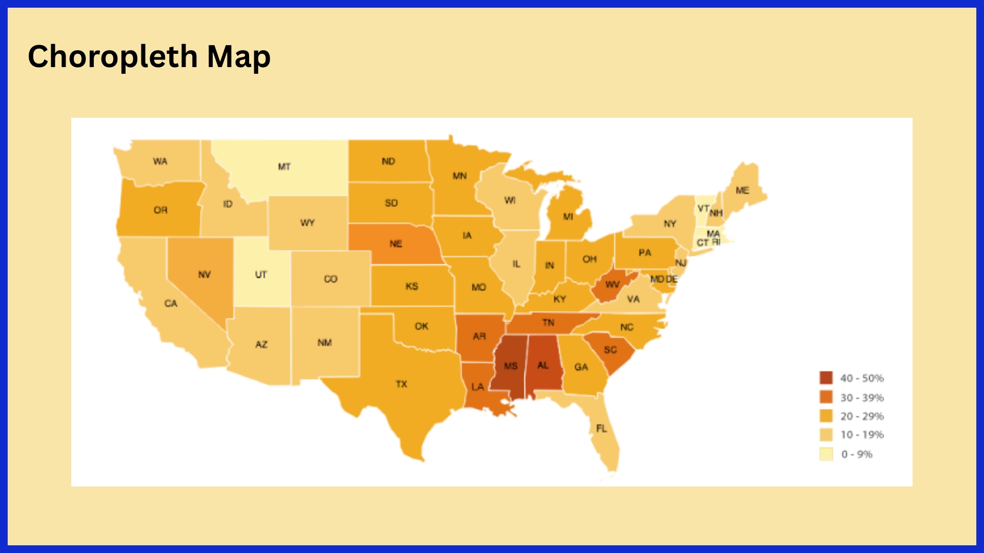
Geo maps help you present geographic information in smart and relevant ways. In US marketing, you’ll more likely see these maps used to display sales per state, campaign reach per city, or store visits per region. Choropleth maps are the most common geo map, using shading or coloring to indicate density or value.
Darker shades indicate higher densities or values. Marketers use geo maps to identify areas where a campaign performs the strongest, identify emerging markets, or develop messages that align with local trends. Interactive geo maps let users zoom, click, and dive deeper into the data, which is useful for big, complex sets of regional info.
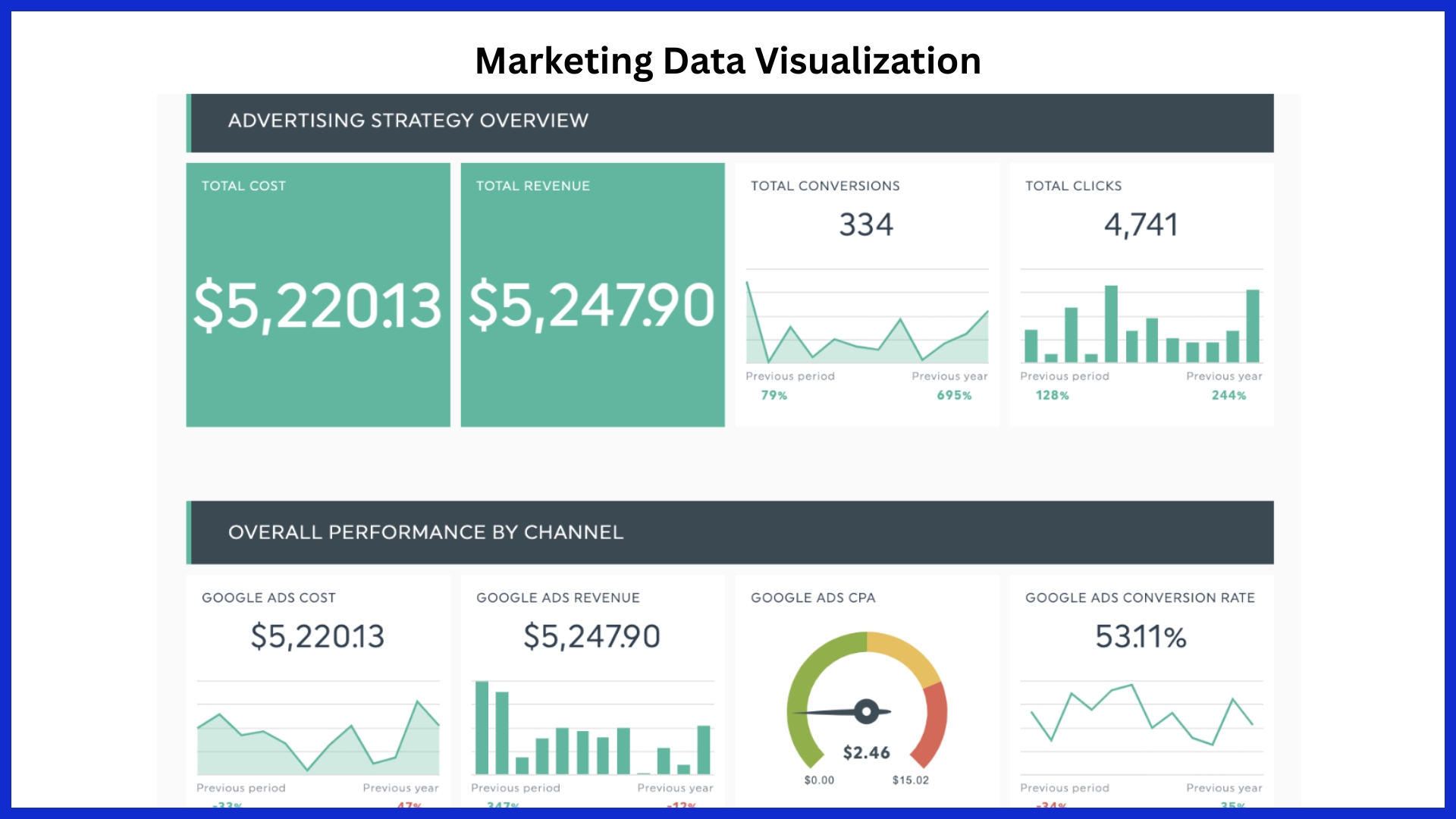
7. Interactive Dashboards: Real-Time Insights
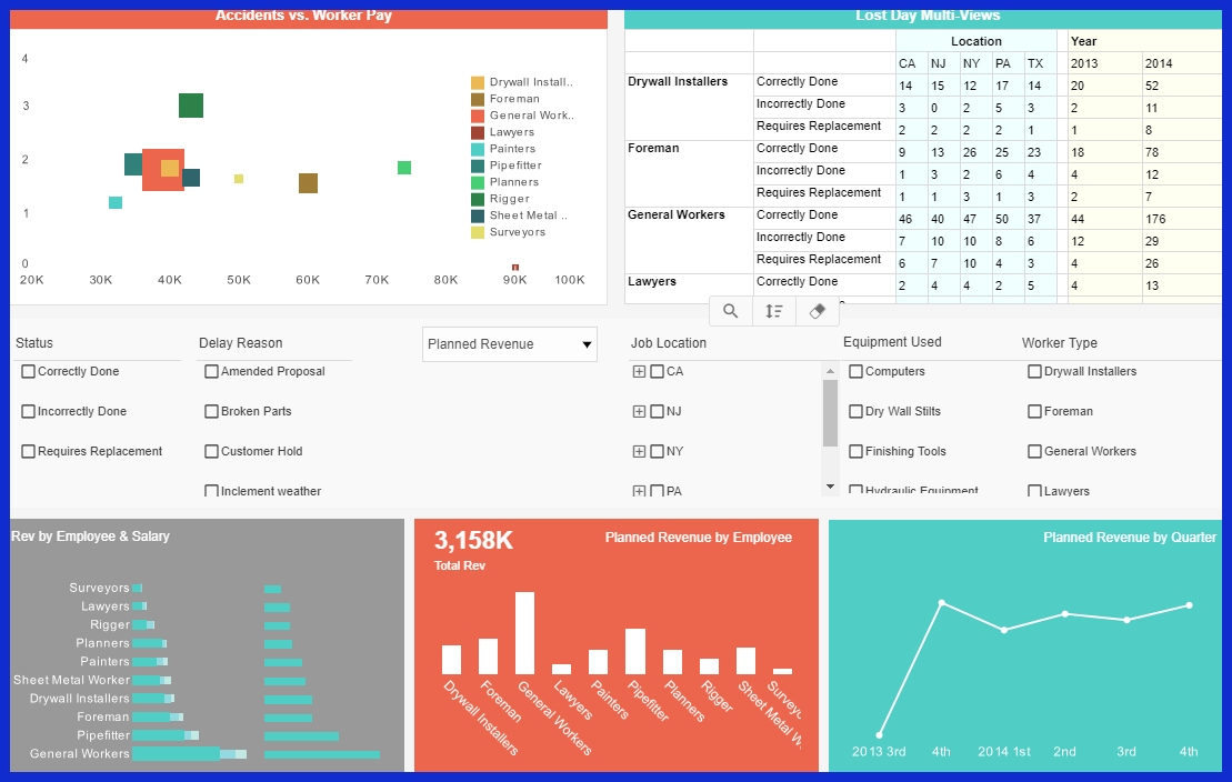
Interactive dashboards take all of these different visuals and bring them under one customizable roof. Interactive dashboards are a game-changer. Customizable dashboards can combine line graphs, bar charts, KPIs, and other data visualizations to create a customized view based on team and stakeholder needs.
Filters and drill-down tools provide the user with the power to zero in on what’s most important, whether that’s by campaign, channel, or market. By connecting to real-time data sources, dashboards enable rapid, data-driven decision-making and ensure that all stakeholders are working towards a common goal.
Craft Effective Marketing Visuals
Effective marketing visuals bring clarity to complex data, help teams spot trends, and show real progress without a deep dive. In the world of marketing, a visual should quickly and easily showcase your accomplishments, identify areas of concern, and demonstrate your value.
To work well, these visuals must fit the overall goals and brand style, stay simple, and use consistent colors and fonts. Teams find it useful to test different formats—like single charts, combo graphs, or interactive dashboards—to see what helps their audience best understand the story.
Define Your Visualization Goals First
Begin by defining your goals for each visualization. What is the most important impression you want your audience to have? Where does it connect back to your campaign?
Common examples are to illustrate progress, demonstrate performance against other metrics, or monitor spending against a budget. Some good KPIs to have on the list include conversion rate, cost per lead, and engagement.
Collaborating as a team can help further hone these goals, ensuring that visuals are focused on what will have the greatest impact.
Pick the Right Chart Type
Leave room on your slide for your data. Bar charts are ideal when you’re doing side-by-side comparisons. For example, line charts are best used to track trends.
Pie charts are for showing how something divides into pieces. Combo charts combine types for added context. Here’s a simple guide:
|
Chart Type |
Best For |
|---|---|
|
Bar Chart |
Comparing categories |
|
Line Chart |
Tracking changes over time |
|
Pie Chart |
Showing proportions |
|
Treemap |
Displaying hierarchy |
|
Sankey Diagram |
Flows and connections |
|
Scatter Plot |
Spotting relationships |
Experimenting with new chart types, such as treemaps or Sankey diagrams, can help reveal patterns overlooked by more basic visuals.
Simplicity is Key: Declutter Now
Simplicity is key—declutter now. One point per chart or table max. Get rid of unnecessary icons, labels, or lines that add clutter but no value.
Include plenty of white space and a limited color palette. This makes it incredibly simple to identify trends quickly.
Weave Narratives: Data Storytelling
Effective visuals weave narratives. Good visuals are much more than pretty things to look at. Place your charts in a sequence that aligns with audience cognition—in other words, the problem, then the outcome, then the action needed.
Including a brief case study or real-world example grounds the narrative in tangible work. Visual metaphors, such as a funnel for leads, help concepts resonate and numbers stick.
Ensure Accuracy and Context
When you present data, review it for accuracy. Make sure to fact-check your material and be transparent about your messaging.
It is terrifying how even the smallest mistakes can derail an entire report. Include annotations or tooltips to offer additional context.
Go the extra mile to keep things honest by providing context, such as last year’s numbers for comparison!
Essential Tools for Visualizing Data
These modern marketing teams understand that effective marketing data visualizations are key to transforming raw figures into a compelling story. With the right data visualization tools, teams can identify emerging trends, respond to complex inquiries, and effectively communicate findings to clients or internal leadership. There is no silver bullet; selecting the best visualization platform is based on team expertise, project requirements, and funding.
Powerful BI Platforms
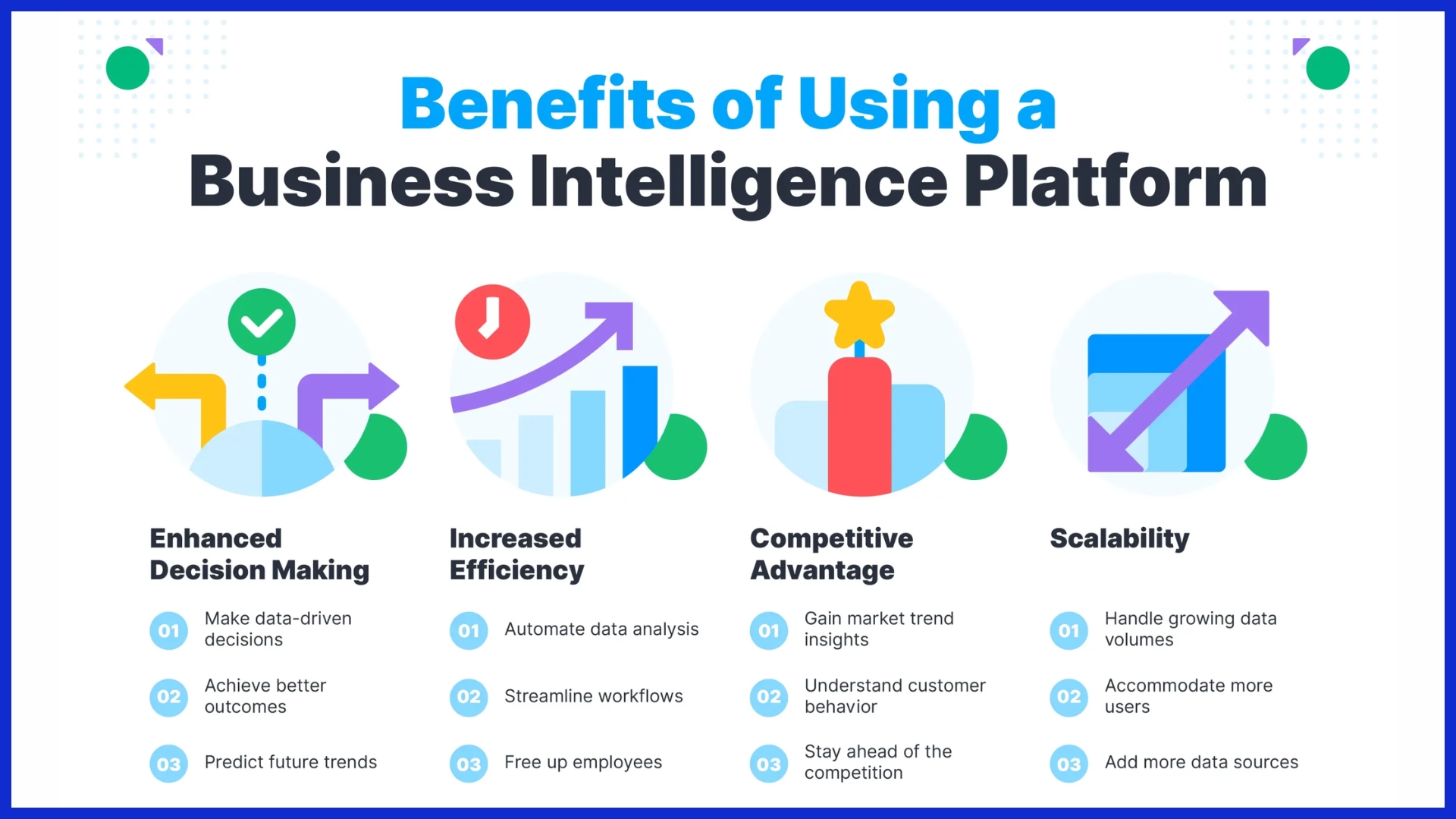
Powerful BI platforms Business intelligence (BI) platforms such as Tableau, Power BI, or Looker, are great tools for big teams requiring complex, thorough analysis. These tools offer real-time data integration and interactive dashboards to easily visualize and track campaign goals or ad spend.
Interactive dashboards allow viewers to “hover” over charts to view additional information or filter data by geographic region or time period. BI platforms come ready with more than 150 different chart types and hundreds of different map formats. They can make simple line charts to show trends or complex treemaps to visualize budget splits.
In addition, they scale easily as data increases. Choose platforms with user-friendly interfaces and customizability. This enables all the members of your team to work with them with little to no learning curve.
Advanced Spreadsheet Capabilities
Spreadsheets, whether Google Sheets or Microsoft Excel, remain ubiquitous tools for a reason — their flexibility and accessibility. Advanced spreadsheet capabilities such as pivot tables, conditional formatting, and scatter plots allow for increased data analysis and visualization capabilities.
By automating a common chart or report, spreadsheets can save time by quickly generating a report as often as weekly. Since teams routinely connect spreadsheets to visualization tools, they go from messy data to polished graphics in record time.
It’s great for smaller agencies or teams that want a little more control, but don’t require all of the intensive BI capabilities.
Custom Charting Solutions
For agencies that require a distinct aesthetic or specific interaction capabilities, charting libraries such as Chart.js or D3.js allow you to create customized, bespoke visuals. Custom charting solutions are particularly good at visualizing relationships, trends, or networks that default templates don’t capture.
APIs connect these visuals within dashboards or client-facing reports. By collaborating with data analysts, you can create a better output that is more easily digestible and aligned with your desired outcome.
This method is ideal for teams that can make a long-term investment to develop technical skills.
Navigating Visualization Challenges
Marketing data tends to be large, complex, and multi-faceted, complicating the ability to present clear insights at first glance. Utilizing effective data visualization tools can make it easier to celebrate successes, bring attention to problems, and communicate value, all without the need for extensive narratives. To achieve this, teams must overcome common challenges such as overly complex charts and a lack of a clear message, which can lead to frustrated teams and delayed decisions.
In the U.S., teams often find themselves managing data across various platforms, including a marketing analytics dashboard that allows for real-time updates, report automation, and easy sharing with stakeholders. Selecting the right visualization software, such as KPI.me or other popular data visualization tools, can alleviate the burden of manual, error-prone reporting.
Before diving into the creation of visuals, sketching ideas on paper can help clarify each chart’s main point and avoid distractions. Gathering feedback from stakeholders ensures that the chosen data visualization technique resonates with everyone involved, not just the creators, ultimately enhancing the quality of the marketing reports.
Avoiding Common Design Pitfalls
Other pitfalls include excessive colors, overly small lettering, or confusing legends. Instead, use simple labels and ensure that charts are readable in black and white. Continual revisits with new data allow for reimagining insights.
User testing and adherence to fundamental design principles foster trust and transparency.
Future Glimpse: AI in Data Viz
AI is transforming how marketers should be viewing their data. The new AI tools can mine through vast troves of information. To make this happen, they crunch hundreds of variables and billions of data points from news, regulatory activity, sales data, and consumer behavior.
This allows teams to identify patterns and trends that would be easily overlooked through traditional approaches. AI today can help bring together data from your email platforms, Google Analytics, and cloud-based platforms. This gives you a full picture of your marketing performance, measuring from the first click to the very last sale.
AI-Driven Marketing Insights
AI-powered tools dig deep into datasets and can spot trends across channels, like which topics hit best on social media versus search. These machine learning algorithms help to continuously fine-tune all visuals, ensuring they’re as clear and effective as possible and fully connected to user needs.
For instance, you can automate dashboards to refresh automatically, in real-time. Which email subject lines move the needle on conversions? Which content topics are taking off? They’ll be revealing all of this and more.
With AI, visualizations become much more personal, dynamically adjusting charts and graphs to respond to user search and click-through patterns. This allows marketers to respond more quickly and make more intelligent decisions as insights are derived directly from the data, versus speculation.
Predictive Visuals: What’s Next?
Looking forward, predictive analytics will become an everyday feature in marketing data visualization. AI-powered graphs can accurately predict what sales or customer trends will be in the next quarter. Whether campaigns are being implemented or the budget needs to be diverted elsewhere, these predictive visuals guide teams to the right decision.
With automated data storytelling, AI could soon create dashboards that don’t just display trends. It will clarify them, simplifying what can be complex analysis for all.
Continuously learning about the latest AI-powered tools will be key for marketers to stay ahead of the competition. Always keep in mind that there is a need for skilled oversight and an awareness of limitations, such as explainability and ethics.
Conclusion
Savvy U.S. Marketers dominate with easy-to-read chartblasts and pointy dashboards that help them identify hits and misses. A simple bar chart would be enough to visualize ad spend increases following the launch of a campaign. A click-through heat map will identify which web pages attract the most clicks.
These tools eliminate the guesswork and save people hours. Agencies and teams need intuitive ways to identify long-term trends and report on wins. KPI.me’s white-label reports pull all your data into one place, easy to customize and pass along to clients.
No more searching through awkward spreadsheets or jumping between different applications. Looking to get your whole team on the fast track to sharp-looking marketing visualizations? Test out a personalized dashboard and experience just how much easier reporting can be.
Try KPI.me risk-free and experience the smarter way to visualize your data.
Frequently Asked Questions
What is marketing data visualization?
Marketing data visualization is the practice of using data visualization tools like charts and graphs to transform complex marketing data into easily digestible visuals. This enables teams to identify trends, monitor performance, and make effective marketing data visualizations for data-driven business decisions.
Why are visualization techniques important in marketing?
Data visualization techniques enable marketing teams to effectively process and interpret complex sets of data, helping them identify trends, track campaign effectiveness, and communicate findings through impactful marketing data visualizations.
Which types of charts work best for marketing data?
When visualizing marketing data, effective marketing data visualizations like bar charts, line graphs, and pie charts, along with popular data visualization tools such as heat maps, make it easier to see trends, comparisons, or distributions.
How can visualizations improve marketing campaigns?
Visualizations, particularly using effective marketing data visualizations, allow marketers to easily see what is performing well and what is underperforming. This enables them to optimize campaigns in real-time, maximize ROI, and effectively report results back to stakeholders.
What tools are popular for marketing data visualization in the U.S.?
The most popular data visualization tools used for marketing data visualization in the United States include Tableau, Microsoft Power BI, Google Data Studio, and Adobe Analytics. These powerful data visualization platforms facilitate straightforward integration with popular U.S. marketing platforms and data sources.
What are the common challenges in marketing data visualization?
Messy data, selecting a popular data visualization tool, and attempting to include too many details in one visual are common challenges. By focusing on your audience’s needs and using effective marketing data visualizations, you can communicate your message clearly.
How is AI changing marketing data visualization?
AI is making marketing data visualization smarter and easier to use. Here are three ways it’s helping:
-
Automates analysis – AI can quickly go through large amounts of data, saving time and effort.
-
Recommends the best visuals – It suggests the most effective charts or graphs to show your data clearly.
-
Finds hidden trends – AI spots patterns or insights in the data that people might miss.
Overall, AI helps marketers understand their data faster and make betr decisions.