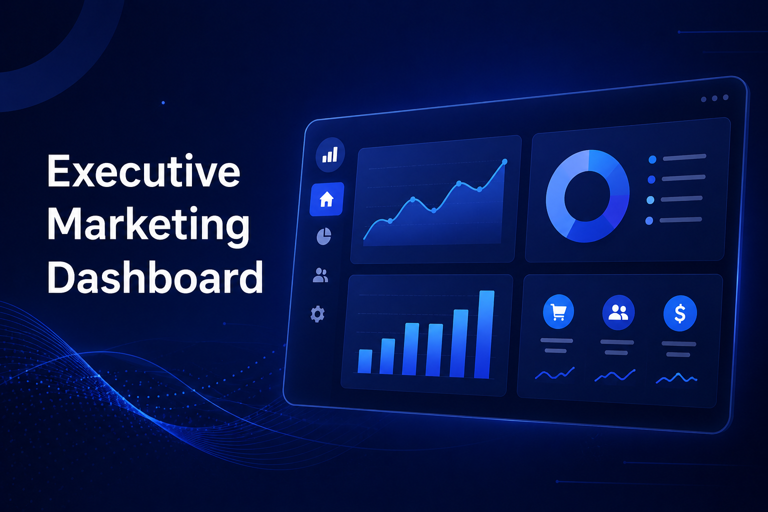
The Executive Marketing Dashboard: What CEOs Actually Want to See
If there is one universal truth in marketing reporting, it is this: CEOs do not care about your granular keyword rankings, search impressions, or micro-level click-through rates. When executives look at a marketing dashboard, they are looking for the story of the business. They care about revenue, growth trends, and return on investment (ROI).
To effectively communicate your marketing success to the C-suite, your dashboard needs to be clean, comparative, and relentlessly focused on the bottom line.
Here is the ultimate blueprint for an Executive Marketing Dashboard—powered by GA4—designed specifically for what a CEO actually wants to see.
1. The Bottom Line: Revenue & Growth
CEOs will always start here. If revenue is trending up, the rest of the dashboard provides the context of how. If revenue is down, nothing else matters until the problem is identified. Cut the fluff and give them the numbers.
Total Revenue [GA4]
![Total Revenue [GA4]](https://kpi.me/wp-content/uploads/2026/05/1-2.jpg)
The single most important metric on the board. CEOs want to know exactly how much money the website generated in a given period. No explanations, no deep dives—just the raw financial impact.
Average Purchase Revenue [GA4]
![Average Purchase Revenue [GA4]](https://kpi.me/wp-content/uploads/2026/05/2.jpg)
This helps executives understand transaction value. Is revenue growing because of a higher volume of sales, or are customers making larger purchases? This metric answers that question instantly.
Revenue per Channel [GA4]
This shows exactly which marketing channels are generating cash. CEOs use this data to make high-level decisions on where to invest more budget and where to cut their losses.
Revenue: All Traffic vs. Organic Traffic [GA4]
![Revenue: All Traffic vs. Organic Traffic [GA4]](https://kpi.me/wp-content/uploads/2026/05/3.jpg)
A direct comparison that answers a favorite executive question: “How much money does our ‘free’ SEO traffic actually make compared to all our paid efforts combined?”
Transactions: All Traffic vs. Organic Traffic [GA4]
This provides volume context for your revenue. Sometimes organic revenue is high because of a few massive transactions; sometimes it’s high because of thousands of smaller ones. This clarifies the story behind the money.
2. Fueling the Engine: Traffic Health & Trends
CEOs know that traffic is the fuel for revenue. While they don’t need to see every pageview, they do need to know if the engine is getting enough fuel to hit quarterly goals.
Total Traffic [GA4]
The top-line view of website visitors. Simply put, CEOs want to see this number trending upward over time.
![Total Traffic [GA4]](https://kpi.me/wp-content/uploads/2026/05/4.jpg)
Organic Search Traffic [GA4]
A key indicator of brand health and SEO ROI. Executives understand that organic traffic acts as a long-term, high-value asset.
Users vs. New Users [GA4]
![Users vs. New Users [GA4]](https://kpi.me/wp-content/uploads/2026/05/5.jpg)
This answers a critical growth question: “Are we expanding our audience and reaching new markets, or just talking to the exact same people?” New users equal brand expansion.
User Activity Over Time [GA4]
A visual trend line that highlights patterns, seasonality, and the overall growth trajectory. (Every CEO loves seeing a line go up and to the right).
Total Sessions: All Traffic vs. Organic Traffic [GA4]
![Total Sessions: All Traffic vs. Organic Traffic [GA4]](https://kpi.me/wp-content/uploads/2026/05/6.jpg)
A volume comparison that puts your organic efforts into the broader context of overall site activity.
3. Delivering Value: Engagement Summary
Traffic volume means absolutely nothing if visitors leave immediately. CEOs need to know if the website is actually delivering value and capturing attention.
Engaged Sessions [GA4]
![Engaged Sessions [GA4]](https://kpi.me/wp-content/uploads/2026/05/7.jpg)
This tracks the sessions that actually mattered (visitors who stayed longer than 10 seconds, converted, or viewed multiple pages). It perfectly filters out the noise of accidental clicks and immediate bounces.
Engagement Rate [GA4]
The percentage of all sessions that were engaged. CEOs love this metric because they can easily compare it against industry benchmarks to gauge overall site quality.
Bounce Rate [GA4]
![Bounce Rate [GA4]](https://kpi.me/wp-content/uploads/2026/05/8.jpg)
The classic metric. While it isn’t as nuanced as the engagement rate, it is universally recognized by executives. They understand that a high bounce rate signals a problem that needs fixing.
Average Session Duration [GA4]
Simple and intuitive. Longer sessions indicate higher interest, better content, and a healthier business.
4. Where Are They Coming From? Channel & Source Performance
CEOs want to know where their customers are coming from without drowning in UTM parameters. These widgets provide a clean, high-level source breakdown.
Session Sources [GA4]
A simple pie chart or list showing the proportion of traffic from Google, social media, direct visits, email, etc. CEOs look at this to ensure risk diversification—they want to ensure there is no single point of failure in their marketing mix.
Top Referrers [GA4]
![Top Referrers [GA4]](https://kpi.me/wp-content/uploads/2026/05/9.jpg)
Specific external sites sending traffic your way. This is incredibly useful for spotting successful PR placements, strategic partnerships, or viral moments.
Sessions by Session Default Channel Grouping [GA4]
GA4’s built-in, standardized channel categorization (Organic Search, Paid Search, Direct, etc.). It is clean, standardized, and highly CEO-friendly.
Users by Default Channel Grouping [GA4]
![Users by Default Channel Grouping [GA4]](https://kpi.me/wp-content/uploads/2026/05/10.jpg)
Similar to the above, but focused on unique people rather than total visits. It helps answer: “Are we reaching unique individuals across our different channels?”
5. The Audience: Geographic & Device Overview
This section provides high-level context about exactly who the audience is and how they are interacting with the brand.
Users by Country [GA4]
CEOs care deeply about geographic expansion. This widget instantly shows whether growth is domestic, international, or both.
Users by Device Category [GA4]
![Users by Device Category [GA4]](https://kpi.me/wp-content/uploads/2026/05/11.jpg)
A breakdown of mobile vs. desktop vs. tablet. Executives use this to dictate technical and developmental priorities (e.g., “If 80% of our users are on mobile, why isn’t our mobile checkout experience faster?”).
6. Driving Action: Key Events & Conversions
The final piece of the puzzle: What meaningful actions are visitors taking once they are on the site?
Total Users by Event Name [GA4]
![Total Users by Event Name [GA4]](https://kpi.me/wp-content/uploads/2026/05/12.jpg)
Shows how many unique individuals performed key actions (like newsletter signups, demo requests, or contact form submissions). CEOs care about real people taking action, not just passive browsing.
Event Count by Event Name [GA4]
![Event Count by Event Name [GA4]](https://kpi.me/wp-content/uploads/2026/05/13.jpg)
The total volume of those key actions. This is crucial for understanding scale (e.g., “We had 500 demo requests this month alone.”).
Key Events [GA4]
![Key Events [GA4]](https://kpi.me/wp-content/uploads/2026/05/14.jpg)
A highly curated list of the most important conversions. CEOs do not want to see every micro-interaction (like a video play or a button hover)—they only want to see the actions that actively move the business forward.
Conclusion
Building a marketing dashboard for the C-suite isn’t about showing off how much data you can collect; it’s about curating that data to tell a clear, actionable story. By focusing on revenue, high-level traffic health, audience engagement, and key conversions, you elevate your reporting from a simple data dump to an indispensable strategic tool. When you give CEOs the bottom-line metrics they actually care about, you build trust, validate your marketing spend, and earn your seat at the strategy table.